Last June, I explained why repeat rate is a vanity metric, but I neglected to offer a better solution for measuring continued customer engagement. I’ve dragged my feet for one simple reason — it’s incredibly hard to shoehorn every business into the same set of financial metrics.
Hard, but not impossible.
Any analysis should start with the same core assumption: repeat customers are the lifeblood of your business. Measuring the velocity of their return, and the value they contribute upon each return, is the most objective way to measure your performance.
At Lightspeed, we are religious about measuring that repeat engagement with a spaghetti graph. In this post, I’m going to walk through how you take raw cohort data and transform it into a spaghetti graph. Then, I’m going to show you how to read the graph and infer what it might say about your business. Finally, I’ll argue why this is the single best way to measure continued customer engagement and why you should worship no other metrics, but this one.
Making the spaghetti
The raw ingredients for the spaghetti graph are simple:
- Monthly net revenue, split by monthly customer cohort. A cohort of customers is a set of customers who first purchase in a given period of time — in this case a specific month.
- Contribution margins, defined as % of net revenue. Contribution is gross profit less other variable operating costs of fulfilling an order.
I generated a set of sample data for a fictitious business. The first tab of the spreadsheet shows raw net revenue cohort data over a period of 26 months. Starting here, I transformed the data onto the second tab by (1) normalizing it by the number of customers in each cohort and (2) shifting the cells to justify left, so that a single column represents a given month of a particular cohort. Lastly, I generated the third tab by (1) adding the rows in a cumulative fashion and (2) multiplying by the contribution margin to derive each cohort’s lifetime value (LTV).
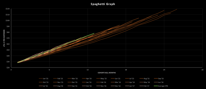
The data are plotted in the spaghetti graph below. Each strand represents a monthly cohort:
Interpreting the graph
Spaghetti graphs are information dense. Each strand represents the cumulative contribution margin of a customer acquired in the month of the cohort, as a function of cohort age. In math speak, it’s LTV as a function of time.
The length and color of each strand demonstrates the age of the cohort (longer & darker = older). The slope of the strand illustrates how quickly a typical customer in that cohort returns to purchase more product (steeper = more frequent). The y-intercept of the strand illustrates the customer’s initial willingness to pay for the product (higher = greater starting order value).
A few key insights are immediately obvious when data is presented in this fashion:
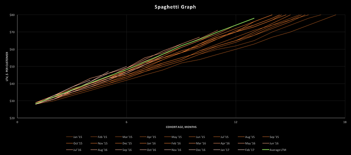
- Are cohorts performing better or worse? If the shorter/lighter lines are crossing the y-axis at a higher point, and their slope is higher, then cohorts are performing better. That is mostly the case in this graph. Note that the green line is the average of the last twelve months of data, and that it is significantly higher than the prior cohorts. This means that the company’s product has improved over time. I’ve zoomed into the above graph so you can see how the strands improve for recent cohorts below:
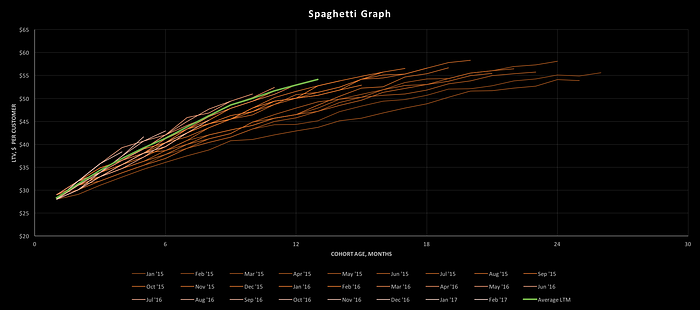
- How consistent is repeat buying behavior? The above strands do not vary their slope much as they age. That means customers return at a regular pace. Other businesses, however, can have LTV curves which saturate, i.e. the slope declines over time. These businesses have burned out their longest running users and generally perform poorly in the long term. Such a spaghetti graph would look like the below:
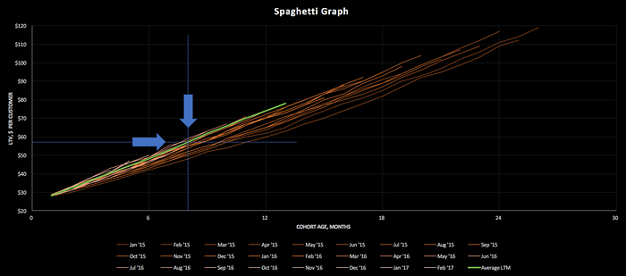
- How much should we spend on customer acquisition cost (CAC)? We can get an estimate for 12-, 24-, and 36-month LTV by extrapolating an average of recent cohorts. A linear extrapolation of the green line suggests that a 36-month LTV for the above company is $174. If we wish to target a 3x LTV/CAC ratio (a typical benchmark at 36 months), we should spend no more than $58 on CAC. That CAC would imply an 8–9 month payback period, which we can easily see by drawing a horizontal line at $58, looking for its intersection with the aforementioned green line, and drawing another intersecting, vertical line down to the x-axis:
One graph to rule them all
We like the spaghetti graph because it displays LTV, CAC, and payback period — the basics of unit economics — all on a single sheet of paper. As a bonus, it easily shows longitudinal improvements in the business. The alternatives, while helpful for answering specific questions, are not sufficient to provide this level of detail.
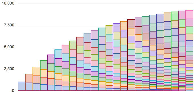
For instance, some founders take total monthly revenue and split it into components from each cohort. The resulting graphs are colorful, but yield little additional insight. As you can see below, it’s hard to visualize the contribution of a given cohort, and you have no idea what LTV is:
Another approach is focused on cohort retention. Retention graphs are useful for measuring temporal improvements in your product, but are less useful for measuring the cumulative value you’re building in your user base:

If you like retention charts, I’d encourage you to use them as a delicious side dish to the main course — spaghetti graphs.
In short, I hope I’ve convinced some of you to start measuring your business with spaghetti graphs. The approach I’ve laid forth is both simple and generalizable, but not perfectly tuned for your business. I’d encourage you to think of this post as a starting point to begin understanding long-term cohort engagement and build the rest of your financial models around it as the atomic unit.
Enjoy your spaghetti!
Authors


